Premium
v1.0
Sleek Dashboard Design for System Health Monitoring
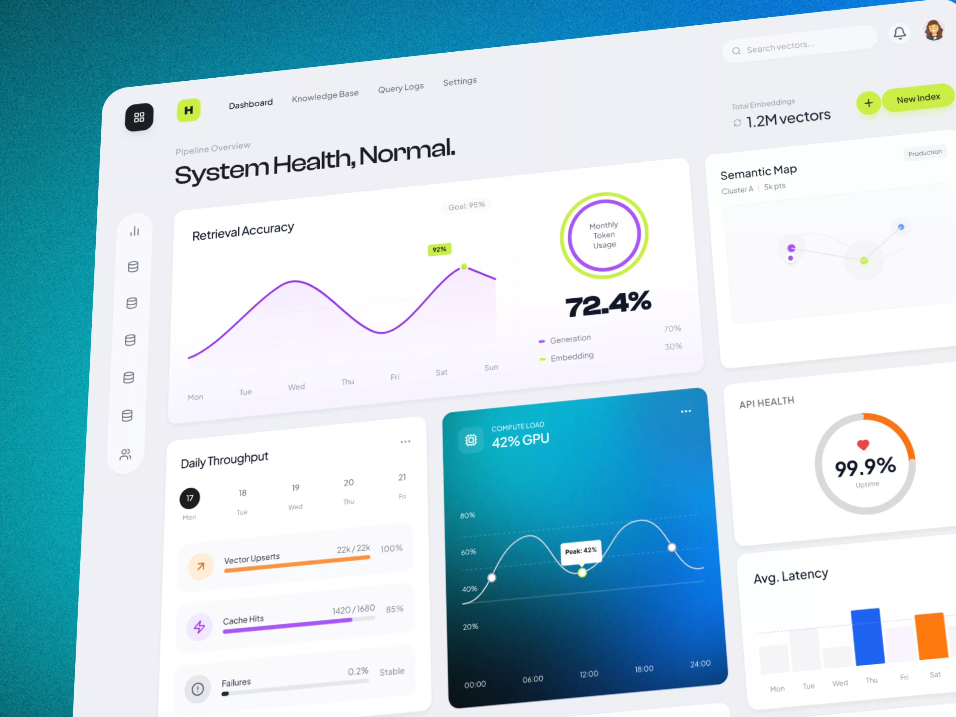
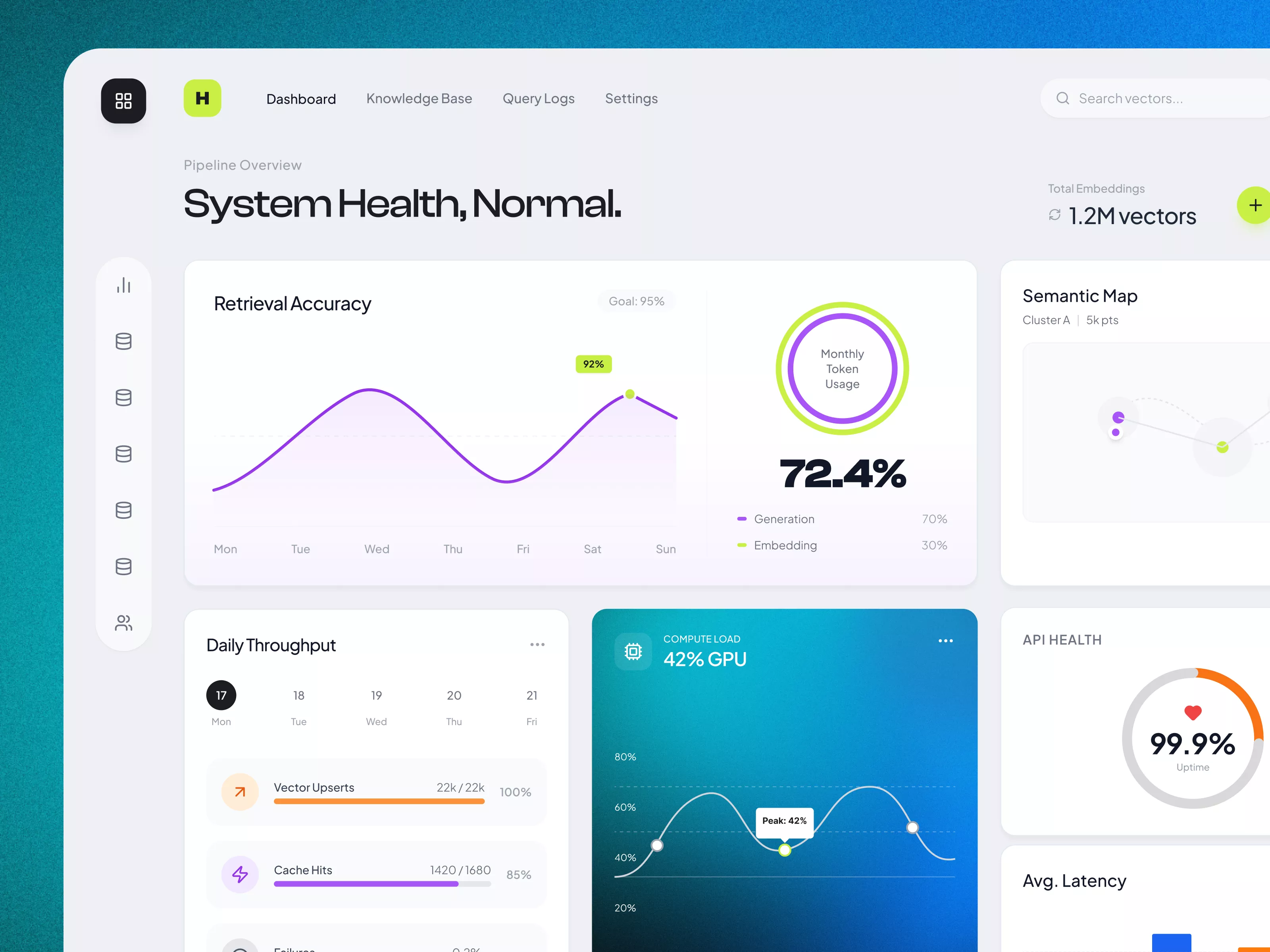
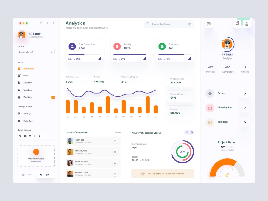
This UI design offers a clear, interactive dashboard for monitoring system health, featuring performance metrics like retrieval accuracy, throughput, compute load, and API health.

About Sleek Dashboard Design for System Health Monitoring
The UI design of this dashboard provides an interactive and detailed visualization for monitoring system health and performance metrics. The interface is minimalistic yet comprehensive, featuring key components such as retrieval accuracy and monthly token usage. A line graph effectively depicts the weekly accuracy progression, highlighted by a clear goal marker. On the top right, an accessible button prompts the creation of a new index, showing attention to user flow and task efficiency. The semantic map section is tastefully incorporated to represent cluster analysis, enhancing the exploratory data visualization aspect. Key metrics like daily throughput, vector upserts, cache hits, and failures are displayed in a straightforward format, utilizing color-coded bars for intuitive understanding. The central compute load section uses a gradient background and line graph to represent GPU usage, adding a visually appealing depth to performance metrics. The API health section concisely shows system reliability with a simplistic circular graph, underscoring 99.9% uptime. The average latency graph offers quick comparative views across the week, ensuring rapid assessment of response times.
Features
- Intuitive Design
- Real-Time Data
- Comprehensive Metrics
- Customizable Views
- Interactive Graphs
- Clear Indications
- Modern Aesthetic
- Advanced Analytics
Frequently Asked Questions
How do I add a new index?
Click the 'New Index' button in the top right corner of the dashboard.
What does the retrieval accuracy graph represent?
It shows the system's retrieval accuracy over the past week, compared to the goal.
How is the daily throughput visualized?
The daily throughput is shown through color-coded bars for vector upserts, cache hits, and failures.
What is the function of the semantic map section?
It provides a visualization of cluster analysis for data exploration.
How can I monitor GPU usage?
The compute load section uses a line graph to show GPU usage throughout the day.
What information does the API health section provide?
It shows system uptime as a percentage using a circular graph, highlighting stability.
Where can I find latency information?
Latency information is presented in a bar graph format under the 'Avg. Latency' section.
How are the cache hits depicted?
Cache hits are represented by a purple bar indicating the percentage relative to the goal.
What does the circular graph in API Health indicate?
It displays the percentage of system uptime, reflecting reliability.
Is the dashboard designed for real-time monitoring?
Yes, it provides real-time updates for system health and performance metrics.
Premium License
Unknown Size
More like this
View all
iStudy - University Dashboard UI Concept Dark Version
865
U
UI Dux
Figma
XD

Finance Dashboard UI Concept
495
U
UI Dux
Figma
XD

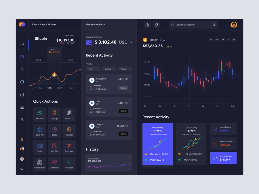
Cryptocurrency Dashboard UI
819
U
UI Dux
Figma
XD

Banking Dashboard UI
552
U
UI Dux
Figma
XD
Dashboard UI Concept for a Freelance Designer
517
U
UI Dux
Figma
XD
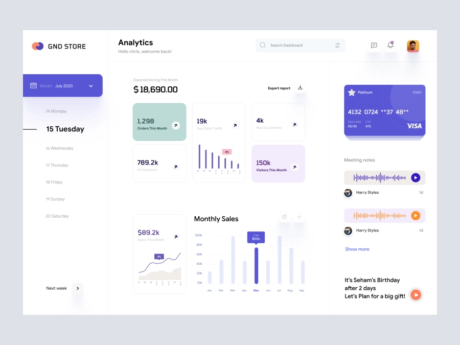
GND Store - Ecommerece Dashboard UI Concept
609
U
UI Dux
Figma
XD
Jaiz - Cryptocurrency Dashboard UI Concept Dark Version
826
U
UI Dux
Figma
XD

Digital Wallet Dashboard UI Concept
110
U
UI Dux
Figma
XD
Free
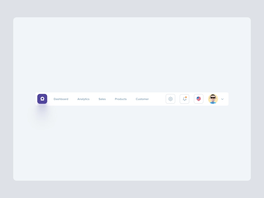
Dashboard Top Nav
221
U
UI Dux
VaultVista - Finance Dashboard Clean UI - Dark Version
702
U
UI Dux
Figma
XD
Banking Dashboard UI
534
U
UI Dux
Finance Dashboard
216
U
UI Dux
Figma
XD
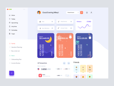
Jaida - Personal Dashboard UI Concept for a Freelance Designer
527
U
UI Dux
Figma
XD
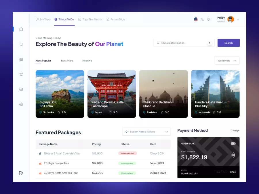
Zaini - Trips and Travel Company Dashboard UI
338
U
UI Dux
Figma
XD
NFT Dashboard
779
U
UI Dux
Figma
XD