Build better products with curated UI resources.
Access a growing library of premium Figma kits and icon sets designed by world-class creators.
Featured this week

Sleek Blockchain Service Platform Design for Modern Web
Introducing an innovative UI design, tailor-made for the modern web3 and blockchain platform, this interface provides a seamless and intuitive user experience. The aesthetic is meticulously crafted to cater to technology-driven industries, highlighting cutting-edge designs that resonate with developers and technologists alike. Featuring a dual-panel layout, the design effectively utilizes dark and vibrant colors to establish a professional and futuristic ambiance. The prominent call-to-action buttons, 'Get Started' and 'Read Documentation', are strategically placed to encourage user engagement, ensuring easy navigation through resources and services. Modern typography combined with geometric illustrations creates a visually appealing hierarchy that guides the user's eye through key components such as data feeds, automation features, and interoperability options. The UI incorporates a responsive, grid-based structure with clearly defined sections for showcasing partnerships and technical specifications. Adaptable for various screen sizes, this design promises superior usability and aesthetic value. Perfectly suitable for Figma, users can easily copy and paste this template directly into their projects, enabling seamless integration and customization for their blockchain platforms. Elevate your digital presence with this sophisticated and powerful UX solution today.
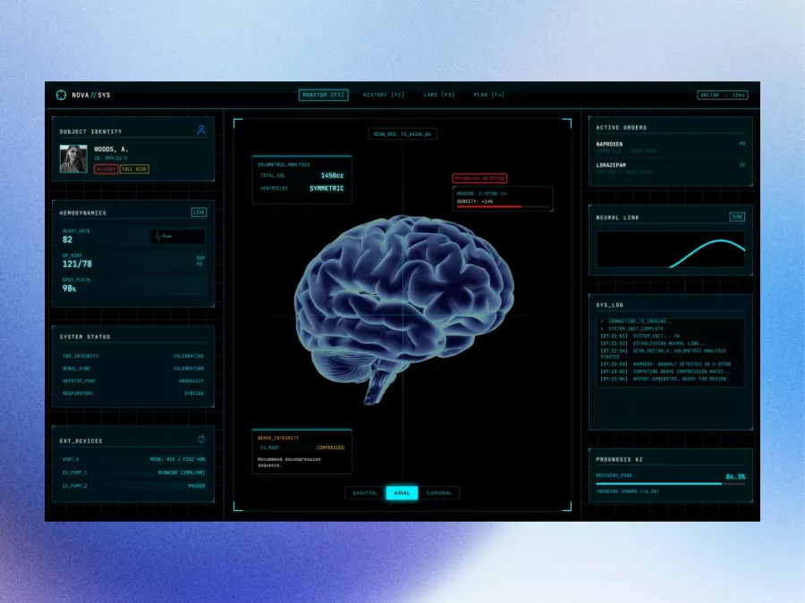
Futuristic Neural Interface Dashboard Design
Immerse yourself in cutting-edge design with this futuristic UI concept tailored for those who crave intuitiveness and aesthetic appeal. This professionally-crafted Figma file offers a sleek, streamlined interface perfect for healthcare technology, complete with real-time data tracking and seamless navigation. The design highlights essential elements such as subject identity, hemodynamics, and active orders, allowing for efficient monitoring and decision-making. The centrepiece features a 3D visualization of a brain, enhancing visual engagement through advanced volumetric analysis and neural link statistics. The side panels provide a detailed system status and log, offering real-time insights and anomaly detection, augmented by an intelligent prognosis AI. The color palette, dominantly rich in blacks and cyans, is complemented by subtle gradients, adding depth and emphasis. Every element ensures clarity and usability, suited for both professional and detailed project presentations. Moreover, its inclusion as a Figma file allows designers to seamlessly integrate the entire layout into their own projects, customizable to fit various requirements without the hassle of file downloads.
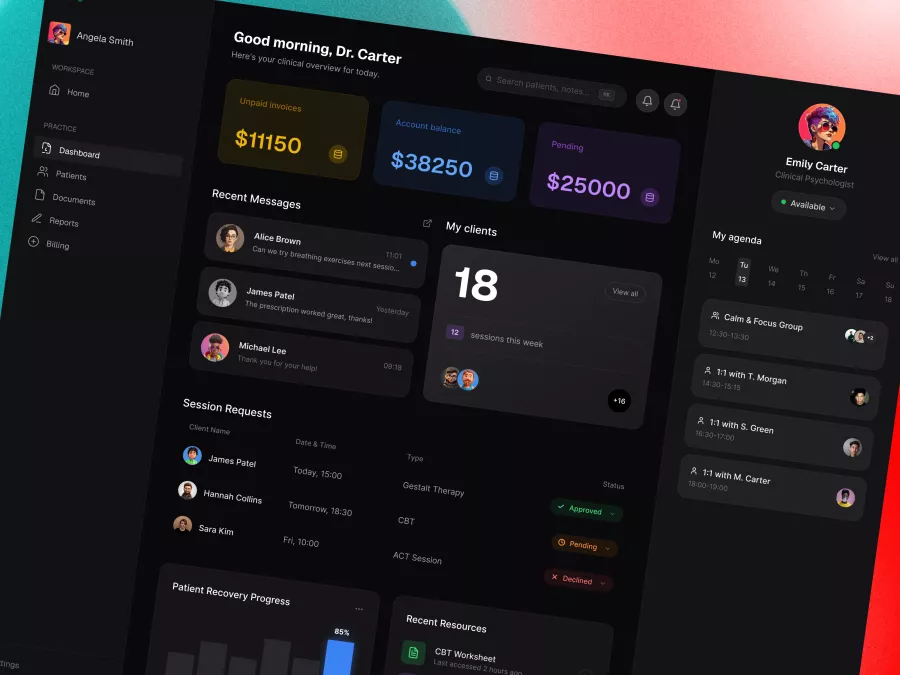
Healthcare Dashboard UI – Mental Health Practice Management Platform
Immerse yourself in a neatly organized and visually captivating UI design tailored for professionals seeking an intuitive dashboard experience. This design emphasizes seamless interaction and accessibility for users who demand a comprehensive overview of financial metrics, client interactions, and session scheduling. The visually appealing color palette of dark backgrounds with vibrant highlights ensures enhanced focus and readability, catering to user needs for clarity and ease of navigation. Among its standout features, the design includes financial summaries such as unpaid invoices and account balances, maintaining a professional edge while facilitating financial oversight. The dashboard design optimally displays recent messages, session requests, patient recovery progress, and essential resources access. It features a right-side panel dedicated to daily agenda management, letting users keep track of their schedule effectively. Additionally, the left-side navigation menu offers quick access to essential sections like Patients, Documents, and Billing, enhancing efficiency. Delivered in a Figma file format, this design allows for instant integration and customization, enabling designers to accelerate their workflow by copying and pasting into their existing projects effortlessly. Its sophisticated aesthetic and high functionality make it an ideal choice for industries such as healthcare, finance, and consulting.
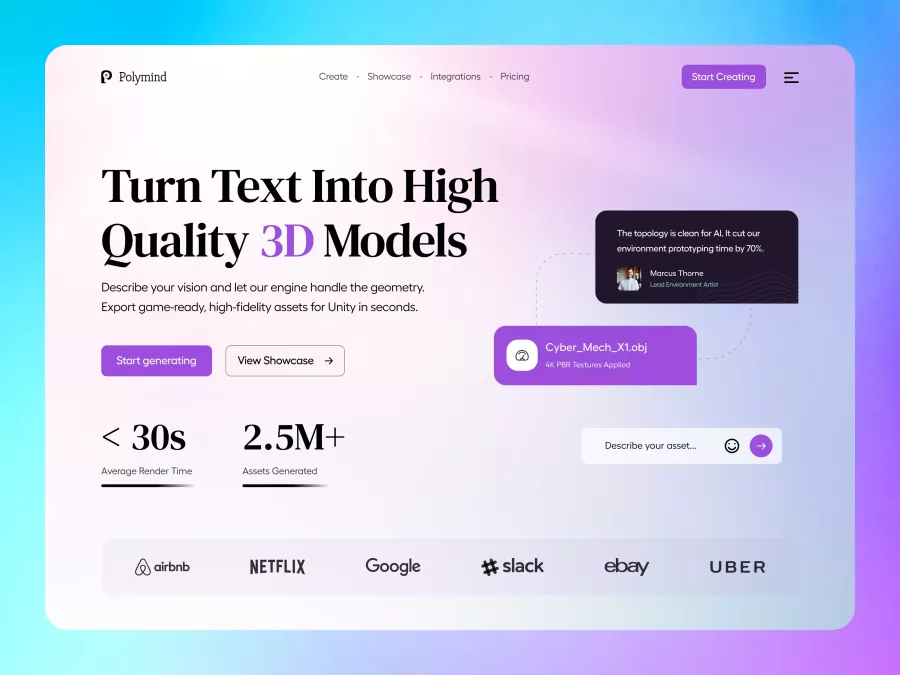
Polymind - AI Creative Tools Hero Section

Wayfare - Travel & Hospitality Hero Section
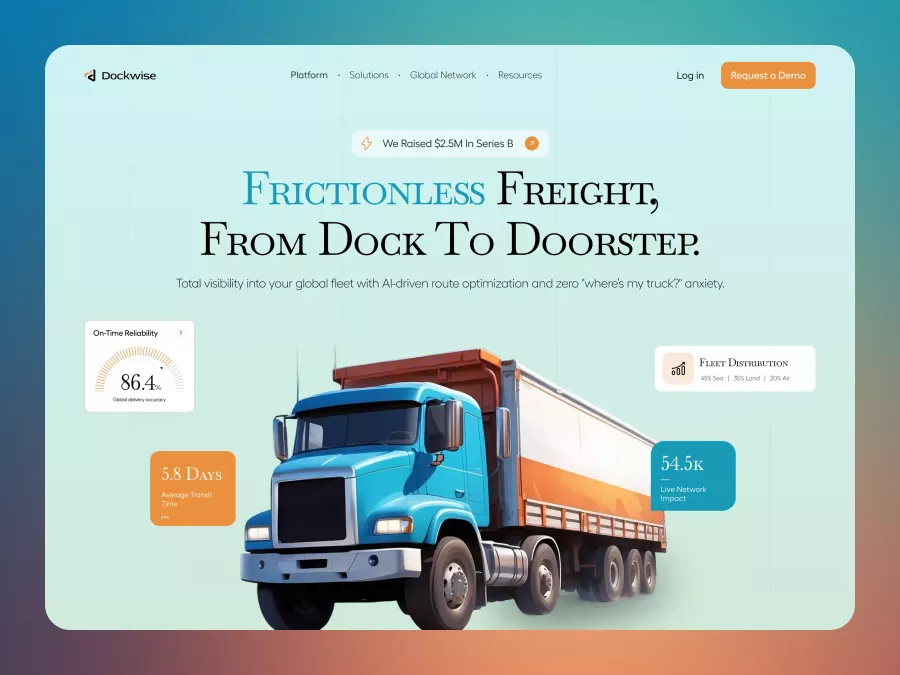
Dockwise - Logistics & Supply Chain Hero Section

Vault - Wealth Management Hero Section
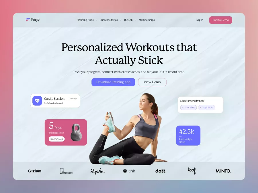
Forge - Fitness & Personal Training Hero Section
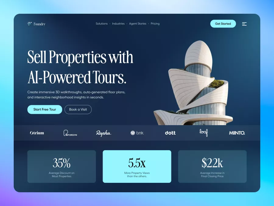
Foundary - Real Estate Hero Section
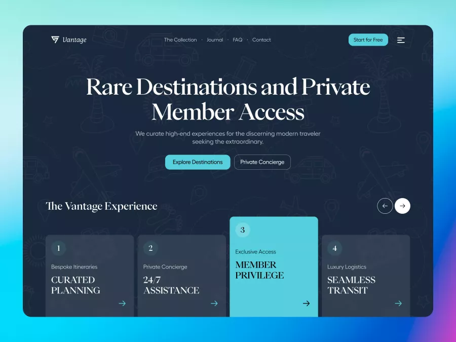
Vantage - Luxury Travel & Concierge Hero Section

Lexicon - Education Platform Hero Section

Kinectic - Creative Agency Hero Section

BioFlora - Eco-Conscious Skincare Hero Section
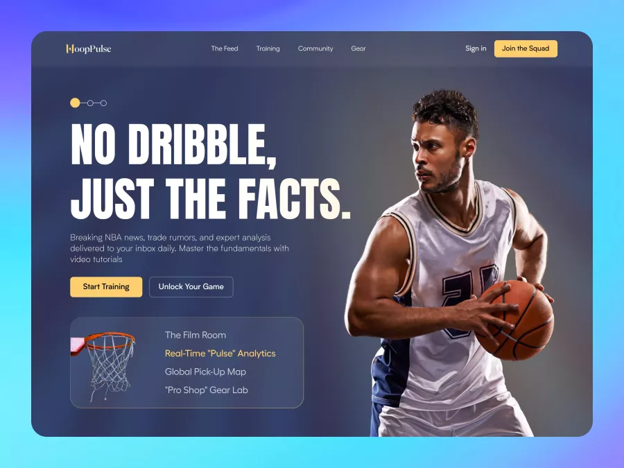
HoopPulse - Basketball Training Hero Section
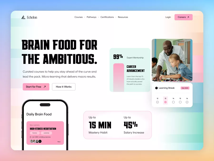
Echelon - Edtech Learning Platform Hero Section
Copied to Clipboard
Figma component copied successfully.
You can now paste it directly into your design.
Permission Required
Please allow clipboard access in your browser settings to copy designs directly to Figma.
Unlock Full Access
Choose a plan to download this premium resource and hundreds more.