Premium
v1.0
Covid Analytics Dashboard UI
Elegant UI design for analytics platforms, featuring interactive dashboards and essential virus statistics. Perfect for professionals needing sleek, functional solutions.

About Covid Analytics Dashboard UI
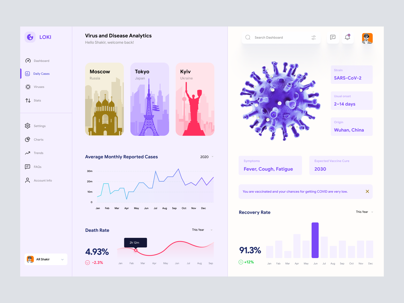
Discover this sleek and advanced UI design, crafted specifically for analytics and information-rich platforms. With a modern aesthetic, this interface seamlessly integrates vibrant colors with practical components to convey complex data effortlessly. The user-friendly layout is enhanced by an interactive dashboard, allowing users to track virus statistics across key global cities such as Moscow, Tokyo, and Kyiv. Critical information, such as average monthly reported cases and essential statistics on virus strains, onset periods, and recovery rates, is displayed effectively. The side navigation ensures easy access to various sections like settings, charts, and FAQs, all within a clean and organized structure. This design is perfect for professionals seeking an elegant yet functional solution. Downloadable as a Figma file, it offers easy customization, enabling designers to tailor components to their project needs without hassle.
Features
- Modern Aesthetic
- Interactive Dashboard
- Comprehensive Data
- Customizable Components
- User-Friendly Navigation
- Figma Integration
- Responsive Design
- Efficient Data Visualization
Frequently Asked Questions
What file format is available?
The design is available in Figma format.
Can I customize the components?
Yes, components can be easily customized in Figma.
Is there a downloading requirement?
No downloading is needed, components can be copied directly in Figma.
Which cities are included in the dashboard?
The dashboard includes Moscow, Tokyo, and Kyiv.
Does this design include data visualization?
Yes, it includes graphs for average monthly cases and recovery rates.
Are virus details like strain and symptoms included?
Yes, virus strain, symptoms, and more are displayed in the design.
What kind of navigation is provided?
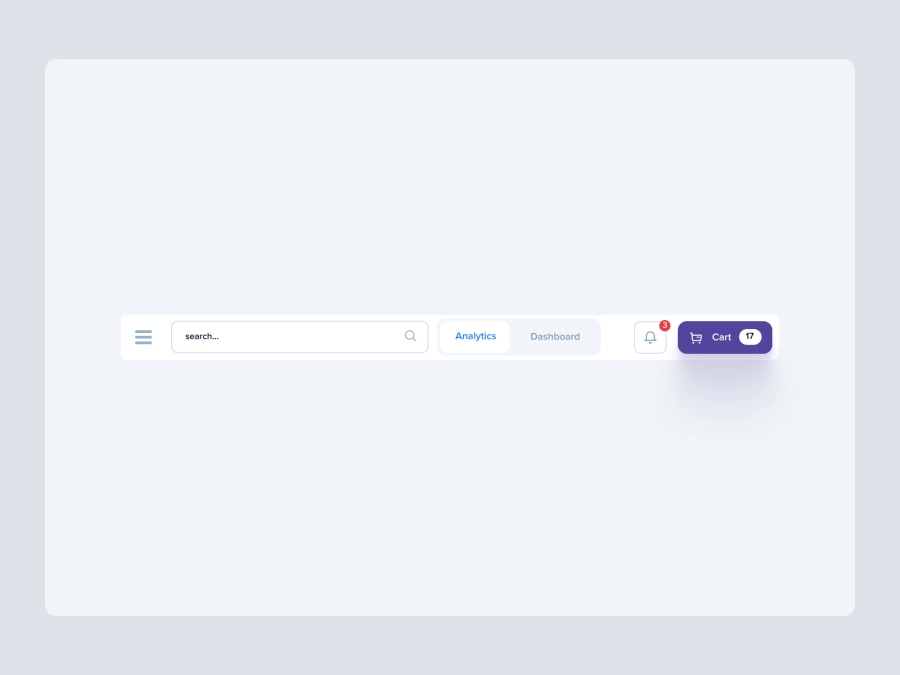
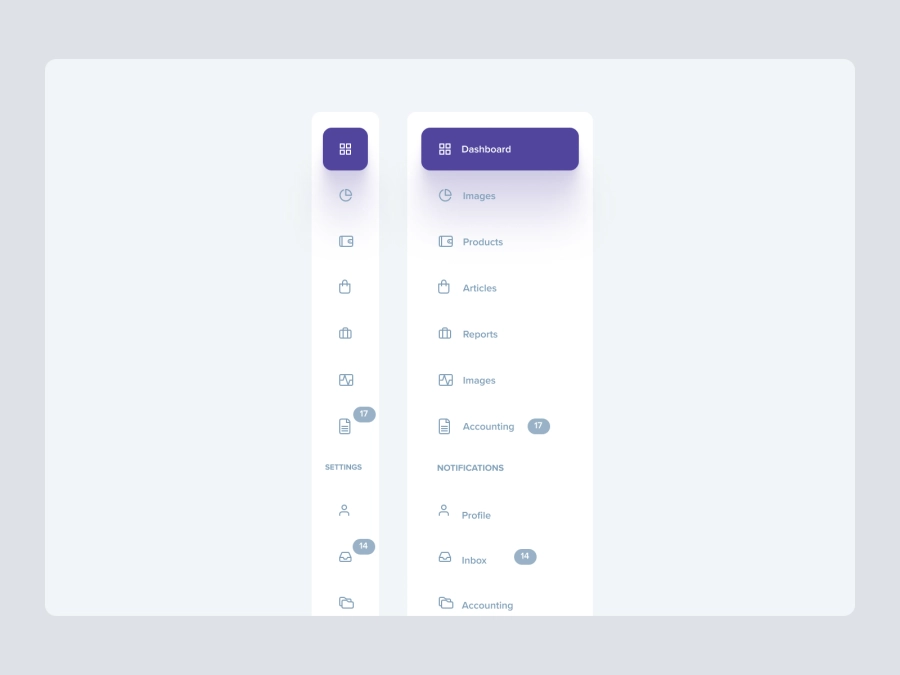
The design features a side navigation for easy access to various sections.
Is the design suitable for mobile platforms?
The design is optimized for web but can be adapted to mobile-friendly versions.
How user-friendly is the dashboard?
It's designed with intuitive navigation and clear layout for ease of use.
What is the purpose of this design?
To provide a comprehensive view of virus analytics with intuitive data visualization.
Premium License
Unknown Size
More like this
View all
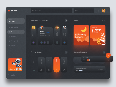
Online Learning Course Dashboard UI
433
U
UI Dux
Figma
XD
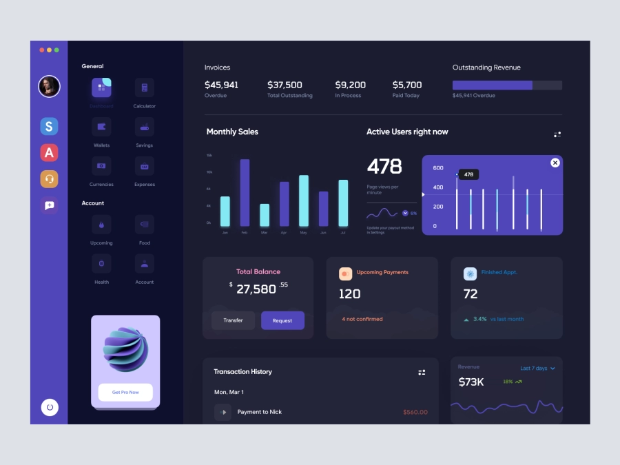
Balinium - Cryptocurrency Dashboard UI
510
U
UI Dux
Figma
XD
Jaiz - Cryptocurrency Dashboard UI Concept Dark Version
432
U
UI Dux
Figma
XD

Banking Dashboard UI
162
U
UI Dux
Figma
XD

Free
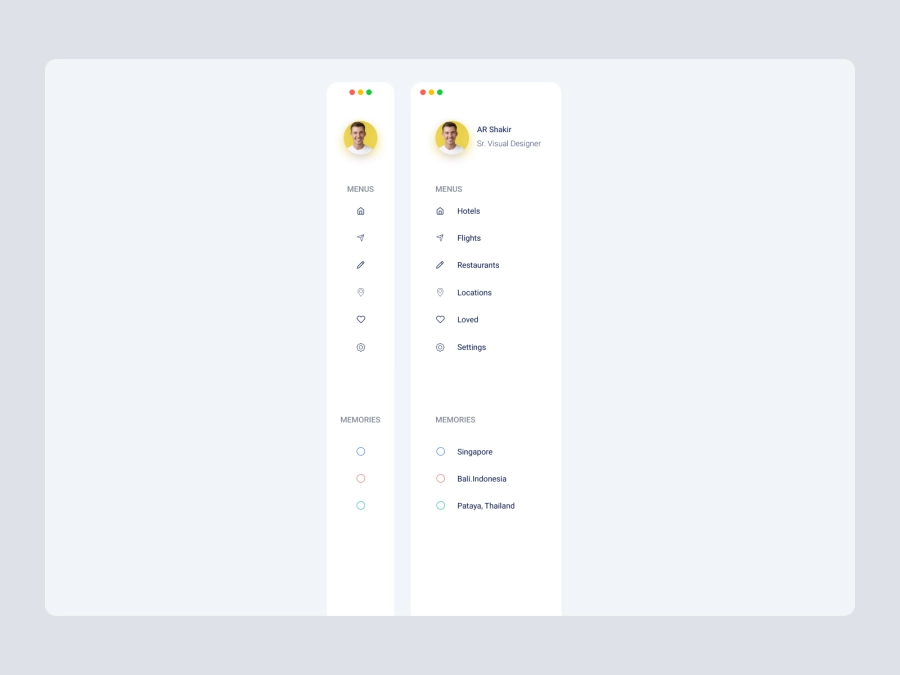
Dashboard Sidebar Navigation
429
U
UI Dux
iStudy - University Dashboard UI Concept Dark Version
225
U
UI Dux
Figma
XD

Music Dashboard UI
667
U
UI Dux
Figma
XD

Finance Dashboard Clean UI
469
U
UI Dux
Figma
XD
Free
Dashboard Sidebar Navigation
537
U
UI Dux
Walleta - Digital Wallat Web App Dashboard
490
U
UI Dux
Figma
XD
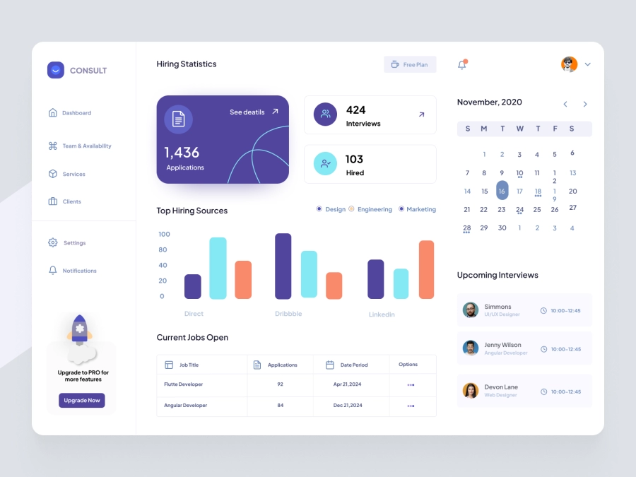
SmileHR - SmileHR - HR Consultant Dashboard
633
U
UI Dux
Figma
XD
Free
Dashboard Top Nav
604
U
UI Dux

eLearning Dashboard UI Design
747
U
UI Dux
Free
Dashboard Top Nav
295
U
UI Dux
EduRakha - Student Dashboard UI Concept
130
U
UI Dux
Figma
XD