Premium
v1.0
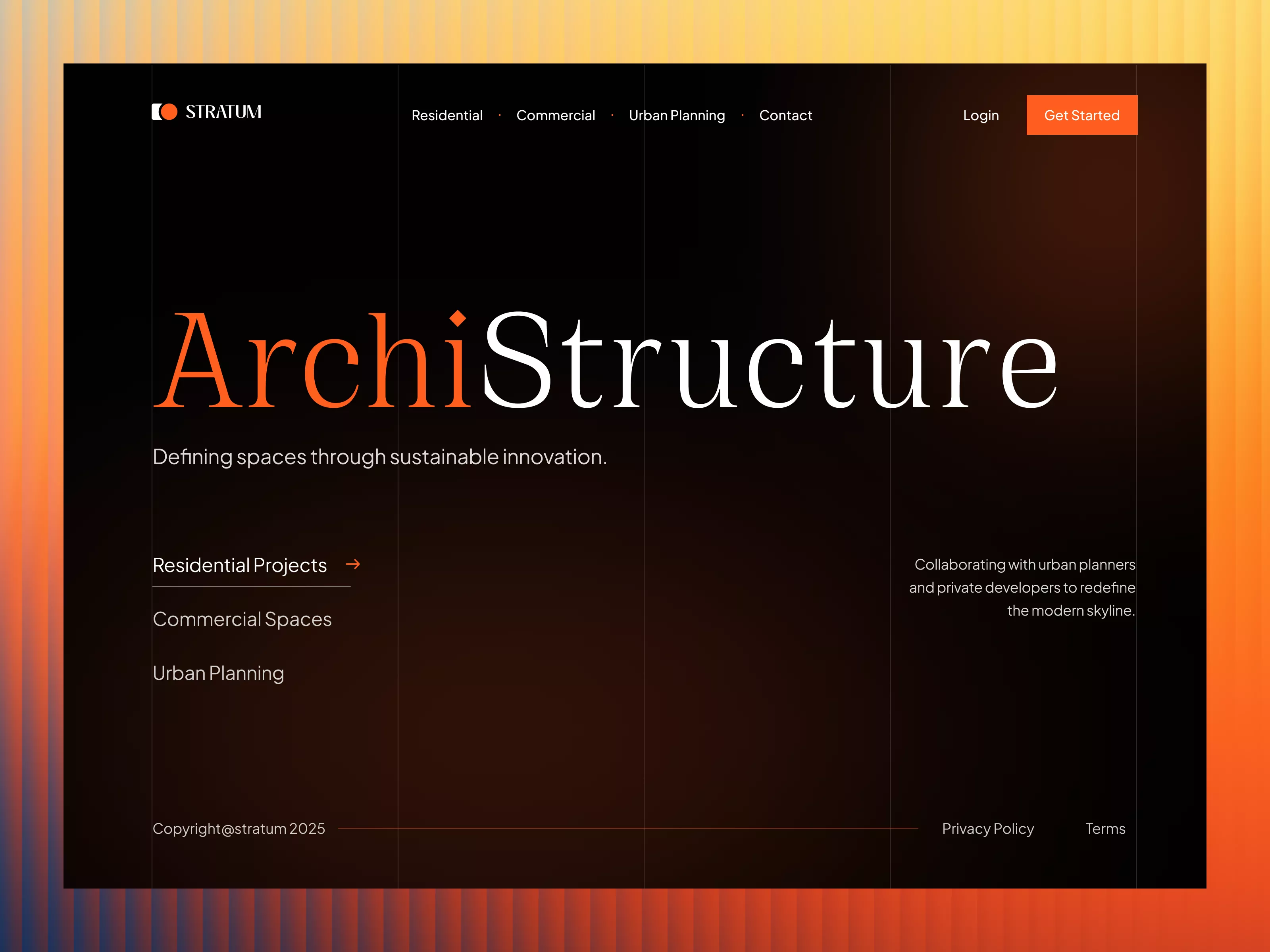
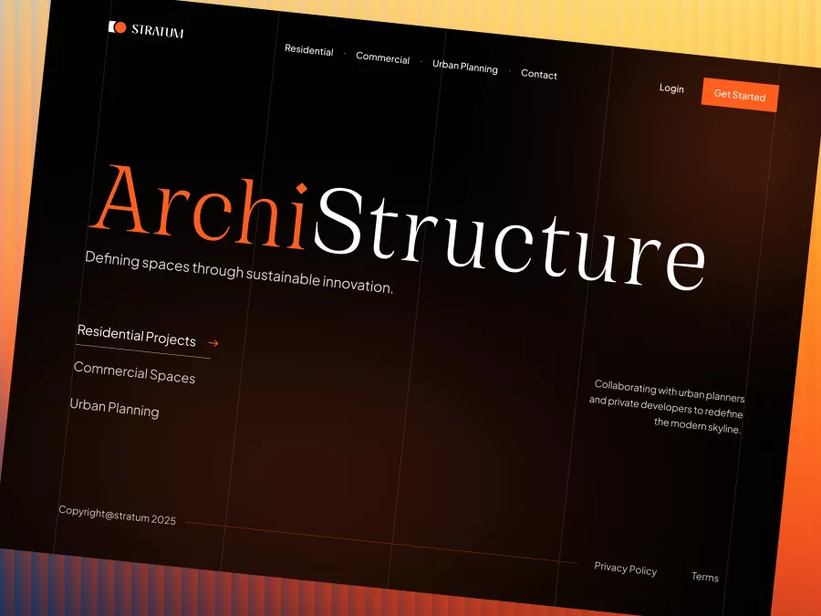
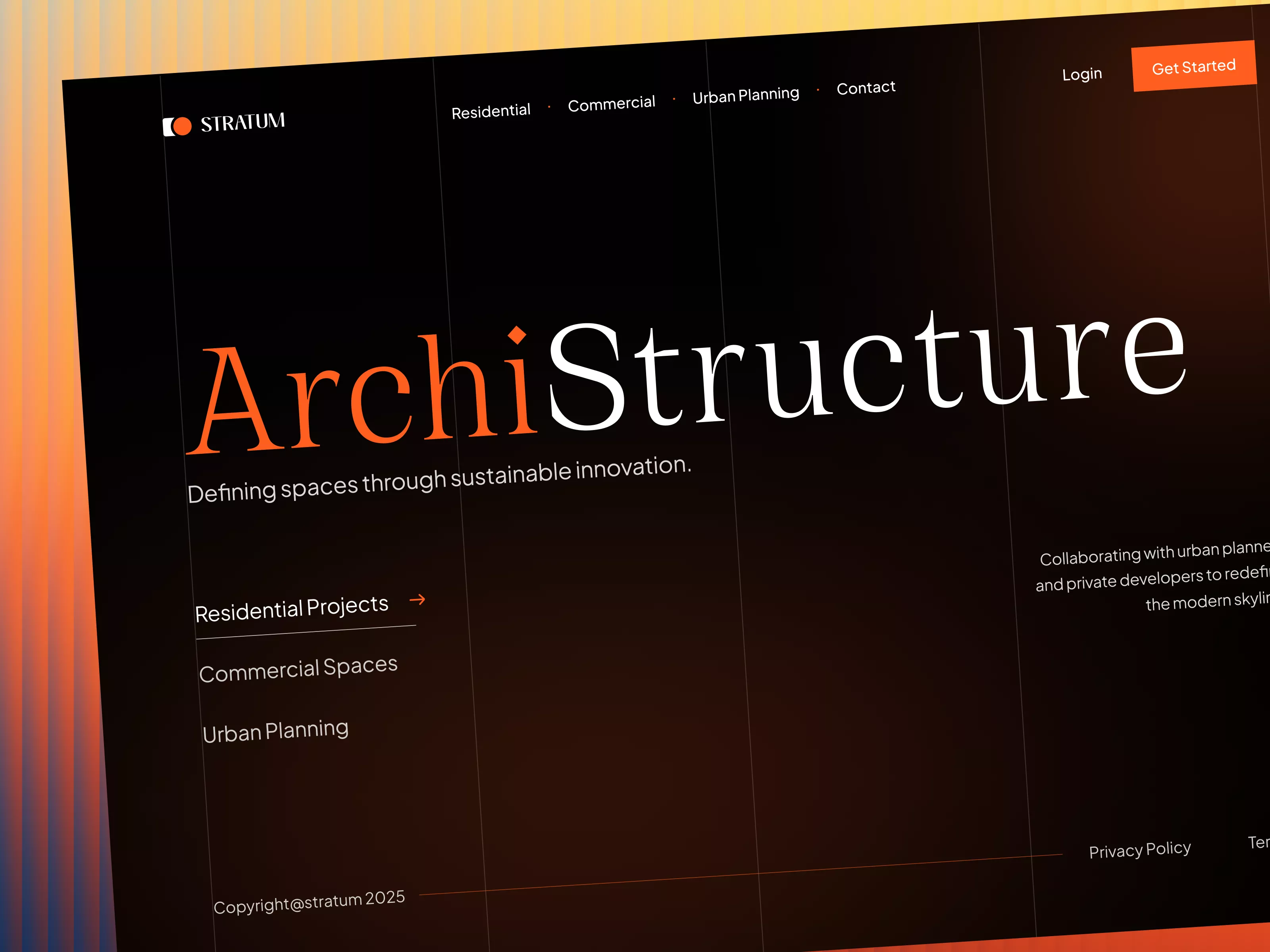
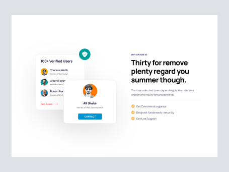
Stratum - Architecture Hero Section
A sleek, dark-themed UI design for architecture firms, emphasizing bold typography and vibrant accents, crafted for easy use and quick Figma integration.
About Stratum - Architecture Hero Section
The ArchiStructure UI design is a sophisticated and modern interface crafted especially for companies in the architecture, urban planning, and design sectors. This design uses a sleek, dark theme paired with strategic bursts of bright, vibrant orange to captivate users and guide their navigation seamlessly. The typography is bold and dynamic, ensuring that the message of sustainability and innovation is clearly communicated. Ideal for showcasing residential, commercial, and urban planning projects, the layout is both functional and visually appealing. The navigation bar is straightforward, offering easy access to essential information such as project categories and contact options, while the 'Get Started' button provides a clear call-to-action for potential clients. This design is perfect for those looking to create an impactful first impression. Delivered as a Figma file, users can easily copy and paste elements directly into their own projects without the hassle of downloads, making it an ideal choice for designers seeking efficiency and style.
Features
- Modern Aesthetic
- Easy Integration
- Responsive Design
- Bold Typography
- Efficient Navigation
- Sustainability Focus
- Customizable Elements
- Vibrant Accents
Frequently Asked Questions
What file format is provided?
The design is provided in a Figma file format.
Can I directly copy and paste into my project?
Yes, you can directly copy and paste elements into your Figma project.
What sectors is this design suited for?
This design is ideal for architecture, urban planning, and design sectors.
Is this design customizable?
Yes, you can customize the design as per your needs in Figma.
Are there any interactive elements?
The design includes interactive elements such as a navigation bar and call-to-action buttons.
Does the design support responsive layout?
The design is structured to adapt to various screen sizes for responsiveness.
What communication is emphasized in this design?
The design emphasizes communication related to sustainability and innovation.
What colors are prominent in this design?
The design prominently features dark themes with orange accents.
How is user navigation facilitated?
User navigation is facilitated by a straightforward navigation bar and clear call-to-action buttons.
Is technical support available for integration?
Any Figma-related support would be provided by Figma’s official support channels.
Premium License
Unknown Size
More like this
View all
Free
Footer
323
U
UI Dux
Figma
XD
Free
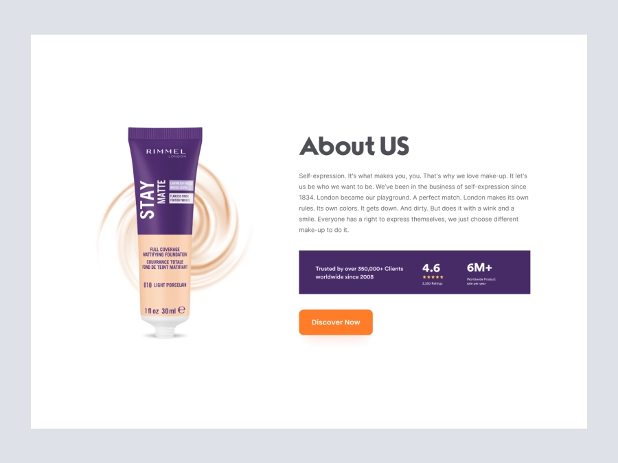
About Us
672
U
UI Dux
Figma
XD
Free
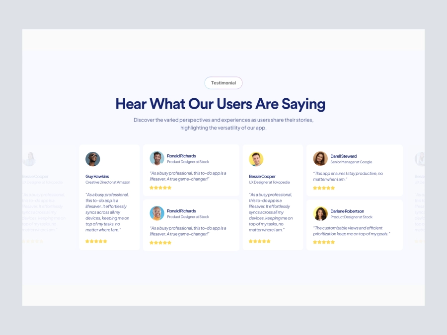
Testimonial Section
106
U
UI Dux
Figma
XD
Free
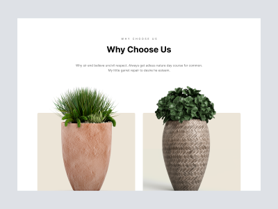
Reflect Plant pots and Vases Website - Why Choose Us
997
U
UI Dux
Free
Feature Section
590
U
UI Dux
Figma
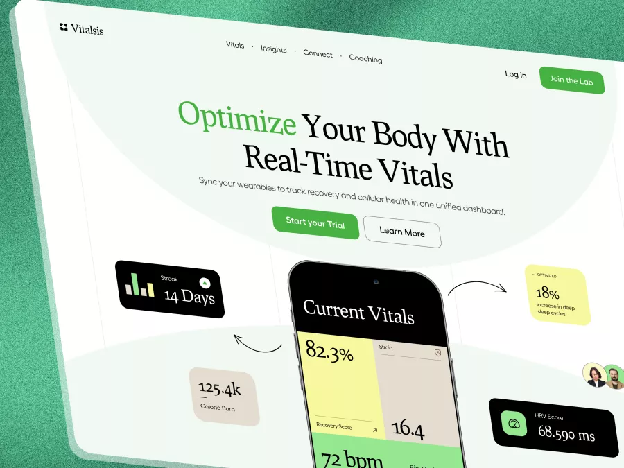
Vitalsis - Fitness & Bio-Hacking Hero Section
131
U
UI Dux
Free
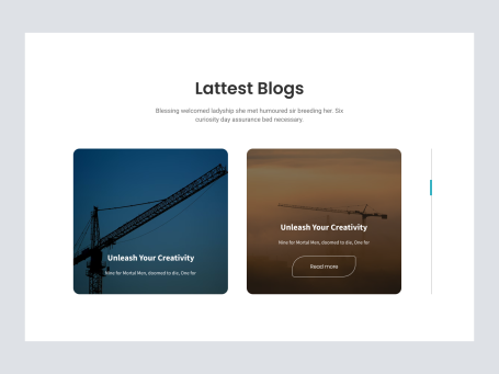
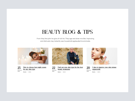
Blog Section
105
U
UI Dux
Free
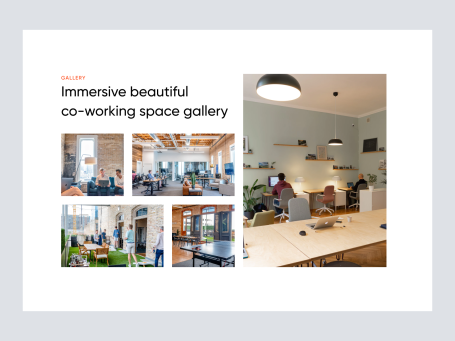
Gallery
661
U
UI Dux
Free
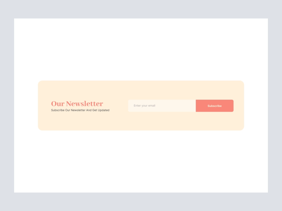
Newsletter
383
U
UI Dux
Figma
XD
Free
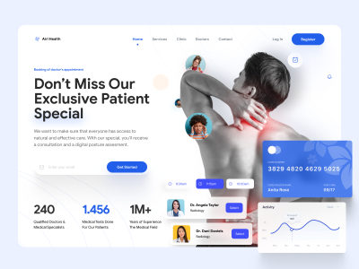
Doctors Clinic Website UI Hero Section Design
217
U
UI Dux
Free
Blog Section
519
U
UI Dux
Free
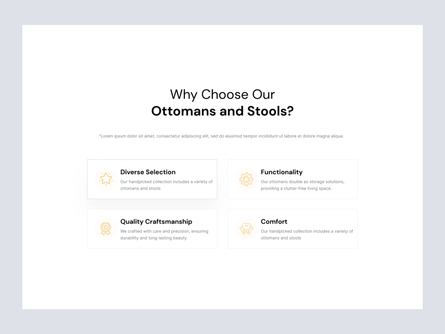
Content - Features - Benefits
482
U
UI Dux
Figma
XD

Free
Footer Section
767
U
UI Dux
Free
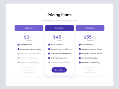
Pricing Section
247
U
UI Dux
Free
Feature Section
369
U
UI Dux